
White. Grey. Maybe beige? If that sounds like your workplace, you’re not alone, but you are missing an opportunity.
Colour shapes how people feel, how they work and how connected they are to the space around them. And in today’s work environment, where offices compete with couches, cafés and coworking lounges, that emotional connection matters more than ever.
The right palette can support focus, reduce stress and boost your team’s mood. The wrong one? It can leave your space feeling flat, cold or just forgettable.
This article explores how our workplace interior designers in Vancouver use colour to transform office spaces into environments that enhance wellbeing, productivity and employee connection.
In a city known for rain, grey skies and long winters, the colours inside the office carry extra weight. They help create warmth, energy and contrast, especially when natural light is limited.
Today’s best office design ideas aren’t solely about looking trendy. They’re about creating places people want to be in. That’s the heart of modern offices. They are flexible, functional and emotionally intelligent.
You might be planning a full renovation, or just looking for office design ideas to refresh a few areas. Either way, choosing the right colour palette is part of a larger workplace strategy and design conversation. A conversation that considers how your space reflects your culture, your brand and your people’s needs.
A few years ago, I started using the term ‘Vancouver-proof’, because if it’s grey outside, our interiors should do the opposite. Why not bring in warmth, light and colour to brighten our days and elevate our mood?
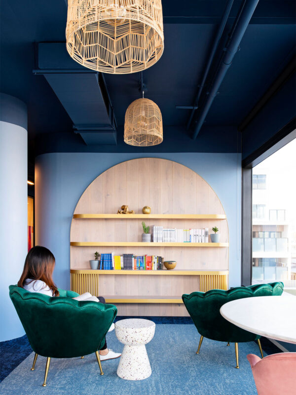
Alex Watkins, Associate Director - Design, M Moser AssociatesThink of a financial firm we worked with in Vancouver. They wanted to shift from formal to approachable without losing credibility. We used deep navy for quiet confidence, warm terracotta to soften the tone and natural woods to ground the space. The result is a space that felt both elevated and welcoming.
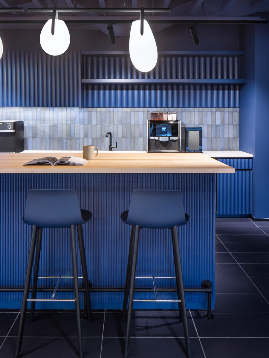
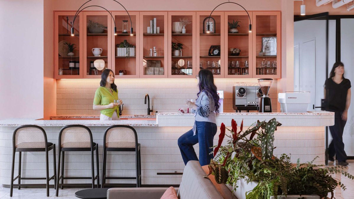
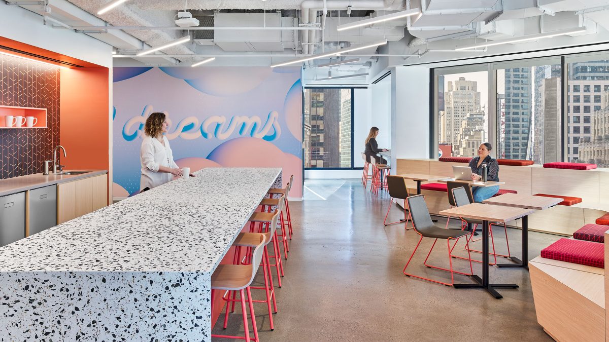
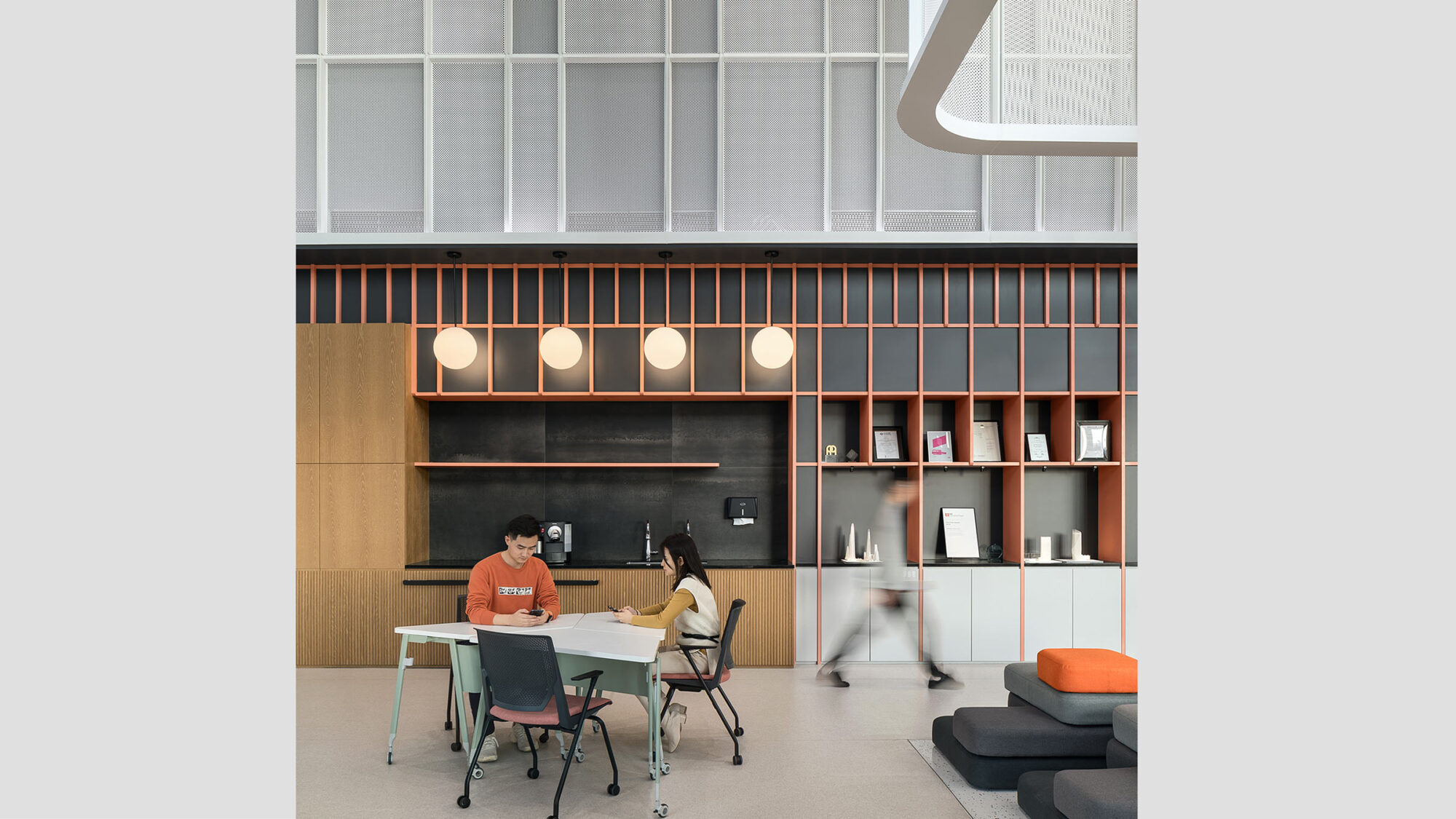
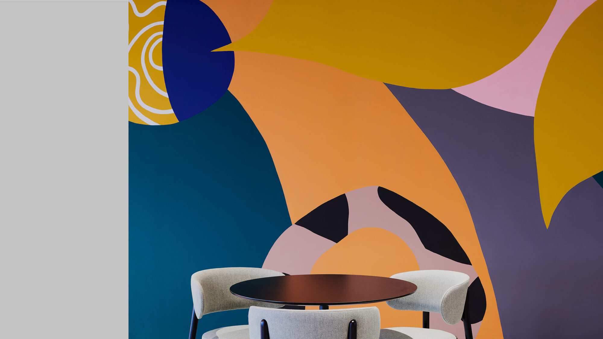
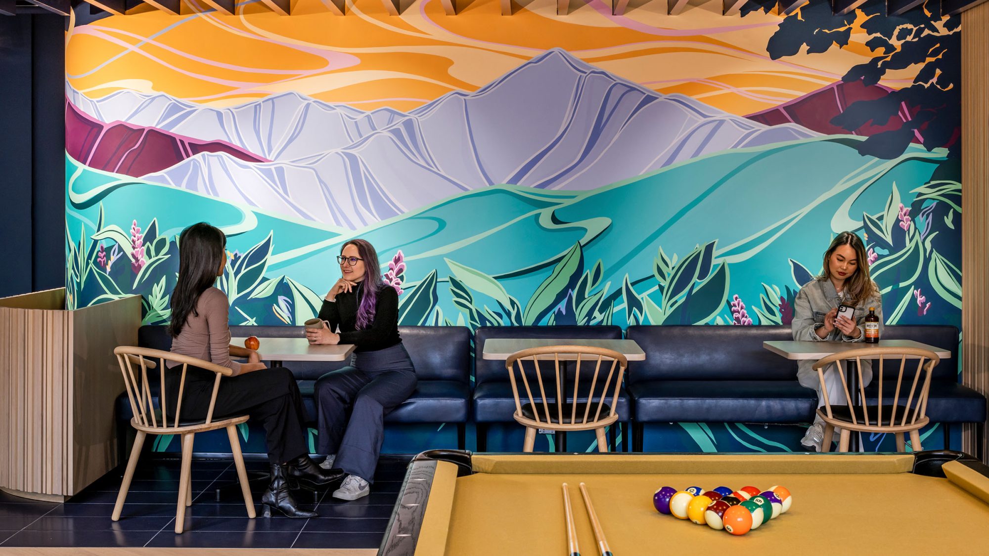
For Match Group’s Vancouver workplace, we used colour as a strategic tool. In a fully hybrid environment, we needed to balance focus and connection. Warm, energizing tones like coral and blush brought vibrancy to social zones like the café, encouraging interaction and creativity. In contrast, cooler hues like sage supported concentration in quiet areas.
As workplace interior designers in Vancouver, we’ve seen how a considered palette can quietly support everything from mental health to productivity. That’s why office interior design services in Vancouver need to think beyond surface-level trends.
Colour can shape how people feel the moment they walk into a space. It’s one of the most powerful, and overlooked, tools in workplace design.
Beatrice Tumatelli, Associate Director - Design, M Moser AssociatesColour doesn’t have to mean bold walls and neon signage. Sometimes, it’s about subtle layering. Accents in soft textiles, artwork, natural tones. Other times, it’s about clearly marking the function of a space. Bold hues for energy, muted tones for calm.
Some of our favourite office interior design ideas play with contrast:
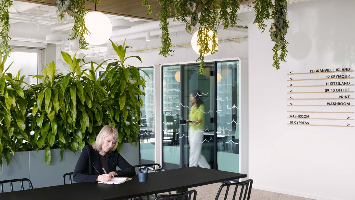
The most effective palettes often take cues from health and wellness trends, biophilia and even local context. Vancouver’s natural landscape, its forests, coastlines and cloud cover, offers a wealth of office design inspiration for grounded, timeless spaces.
Looking for a more relaxing office space idea? Start with colour temperature. Cool blues and greens tend to soothe. Warm neutrals invite comfort. Avoid harsh contrast in spaces meant for rest or reset.
If you’re about to make a change, here’s the key: start with purpose (not paint chips) to build an optimal work environment.
Ask yourself:
Colour is a quiet but powerful tool in your workplace design toolkit. Used right, it brings clarity, connection and comfort to your space. Used wrong, it can flatten everything else you’ve done.
Don’t overthink it and try to not chase trends that won’t last.
Your office is part of your company’s story, and colour helps build upon that narrative. Whether you’re refreshing a few rooms or rethinking your entire space, thoughtful colour choices will support your team in ways they might not even notice, but they’ll feel it.
When we talk about colour in the workplace, we’re really talking about how people experience space. The right palette can help someone feel grounded, energized or at ease without them even realizing why.
Working with a workplace interior designer in Vancouver can help you translate colour psychology into practical, beautiful results that reflect your business.
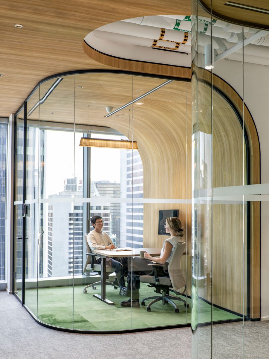
 Match Group, Vancouver: Colour as a backdrop is never passive; it interacts. Every surface reflects something, and when colour meets light, it becomes a filter affecting not just materials and finishes but the subtle tones of our skin and expression in person and on screen.
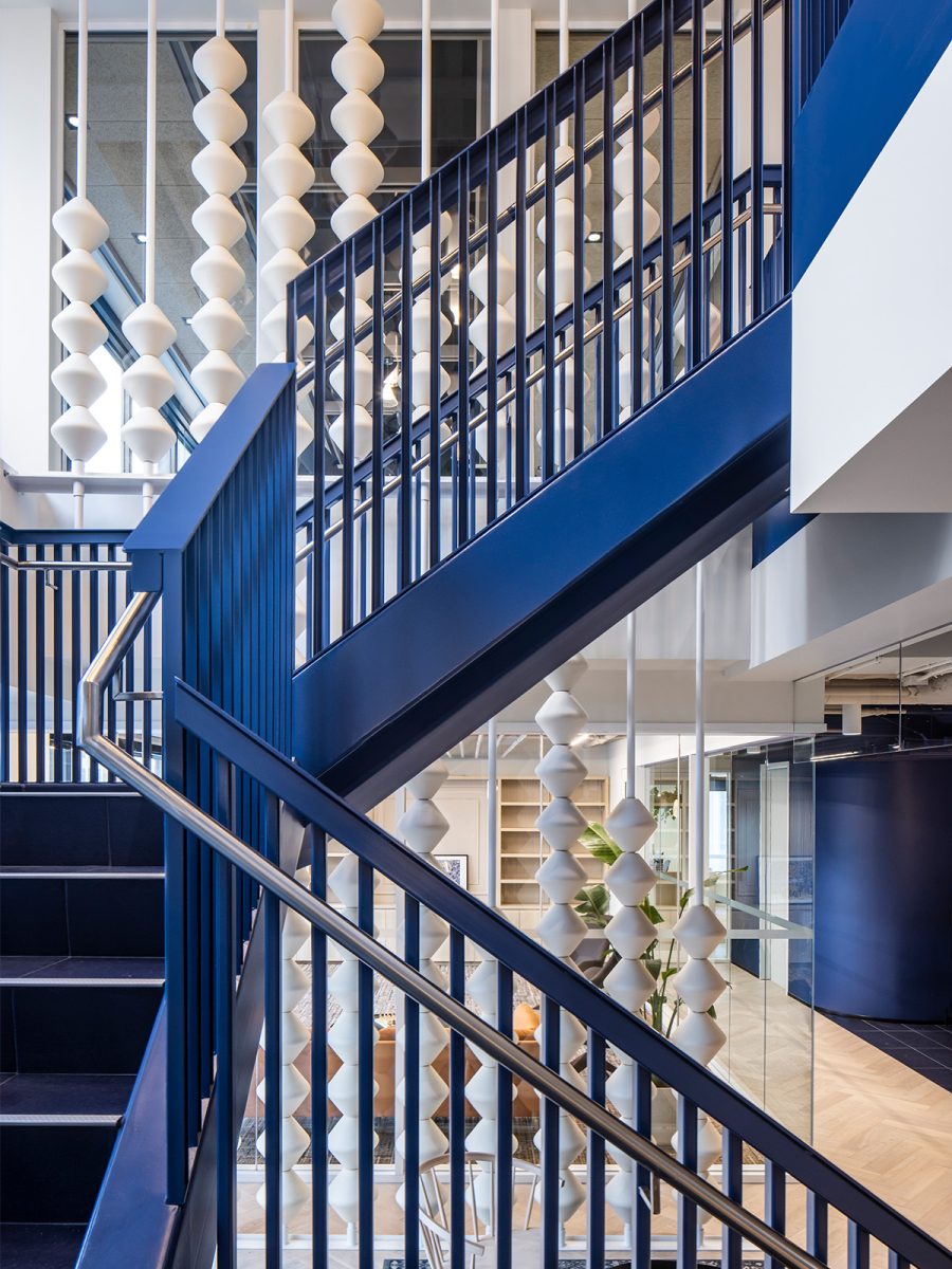
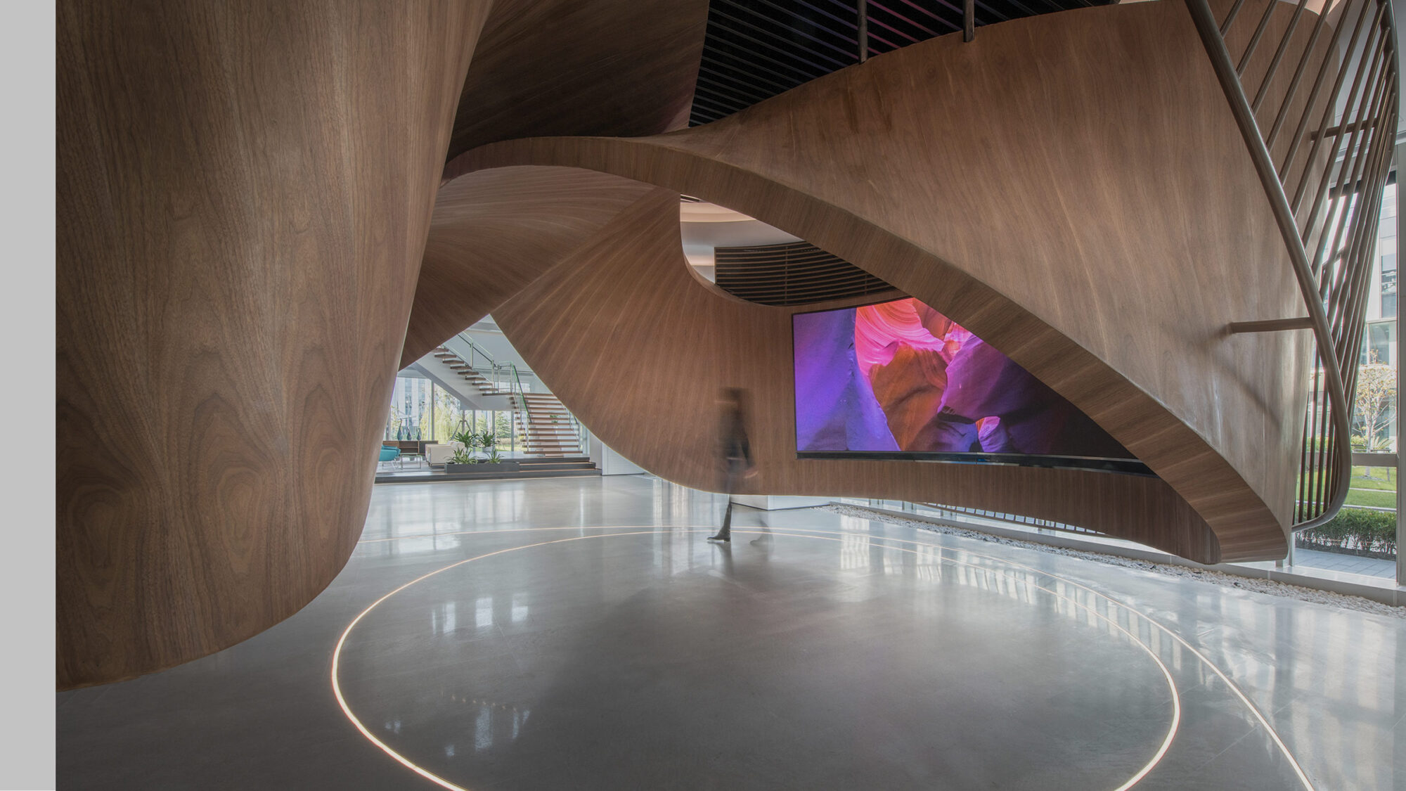
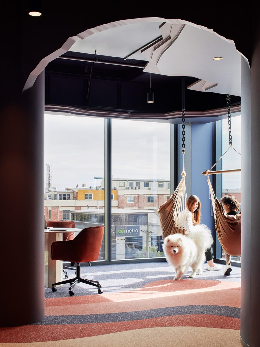
 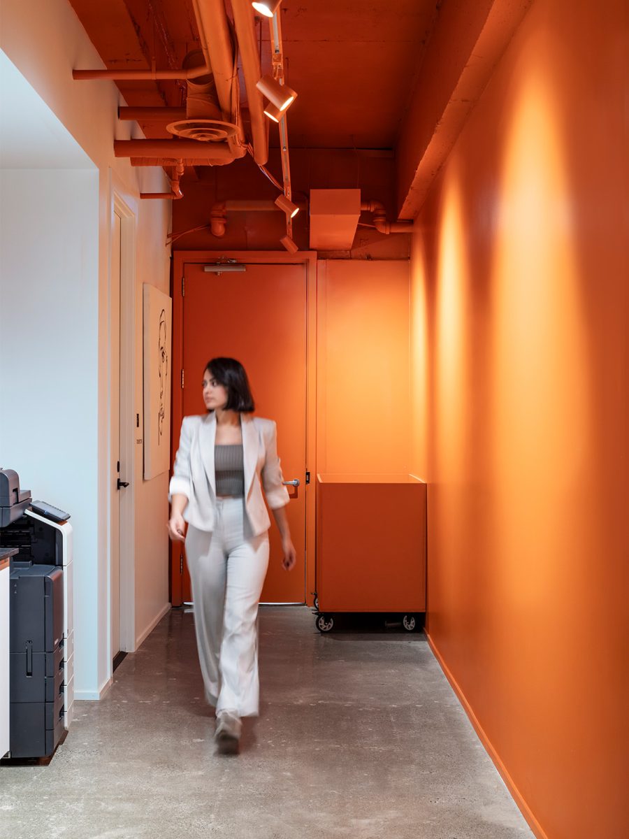 M Moser's Vancouver living lab: When used strategically, colour and lighting can reshape how we perceive a space's scale, depth and dimension.
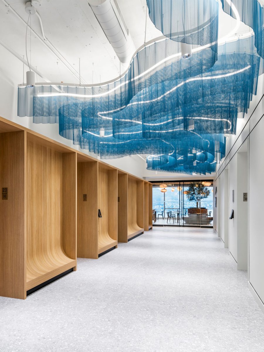
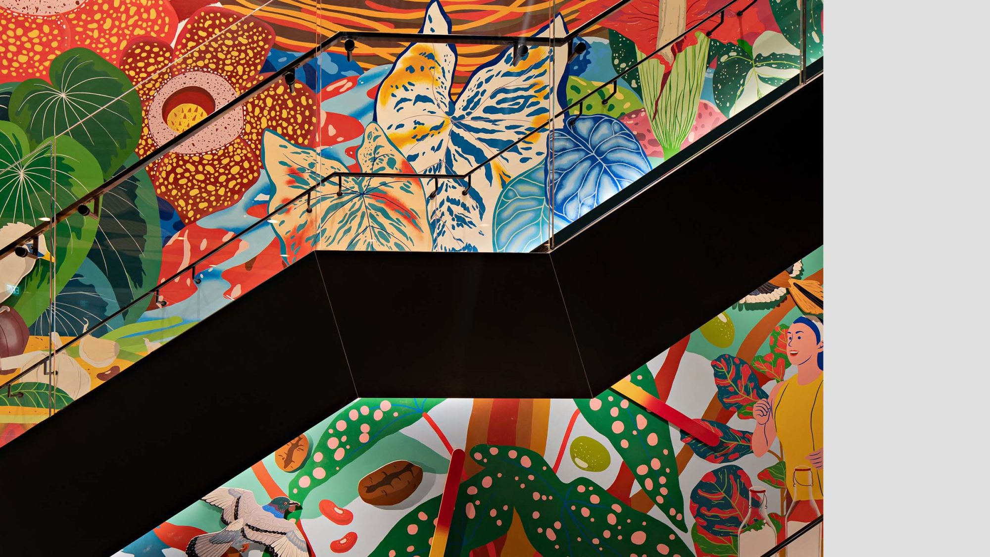
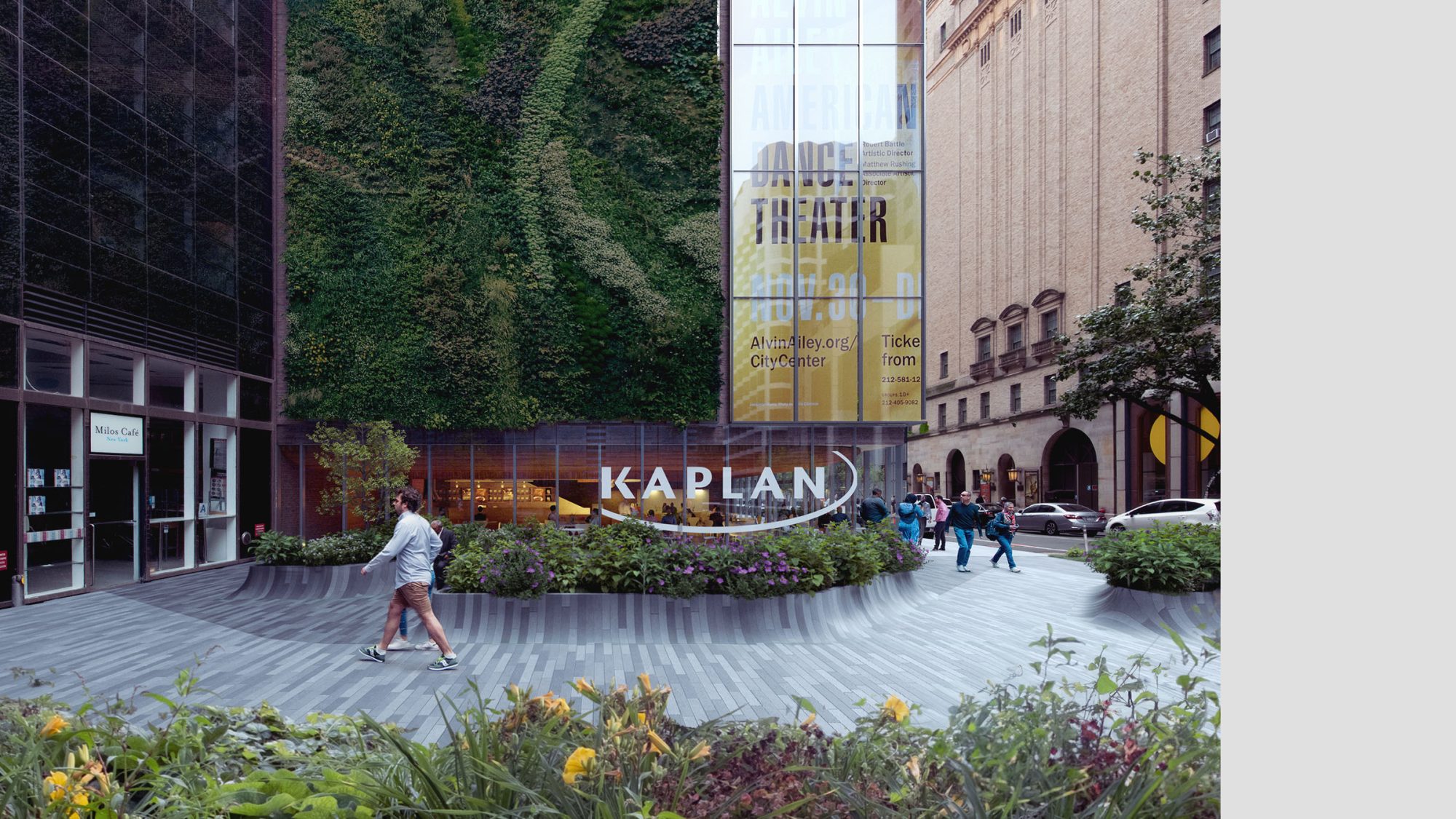
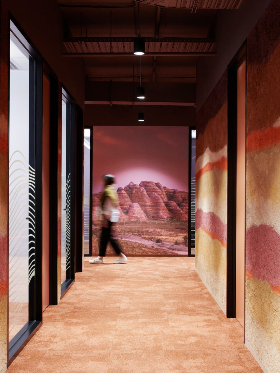
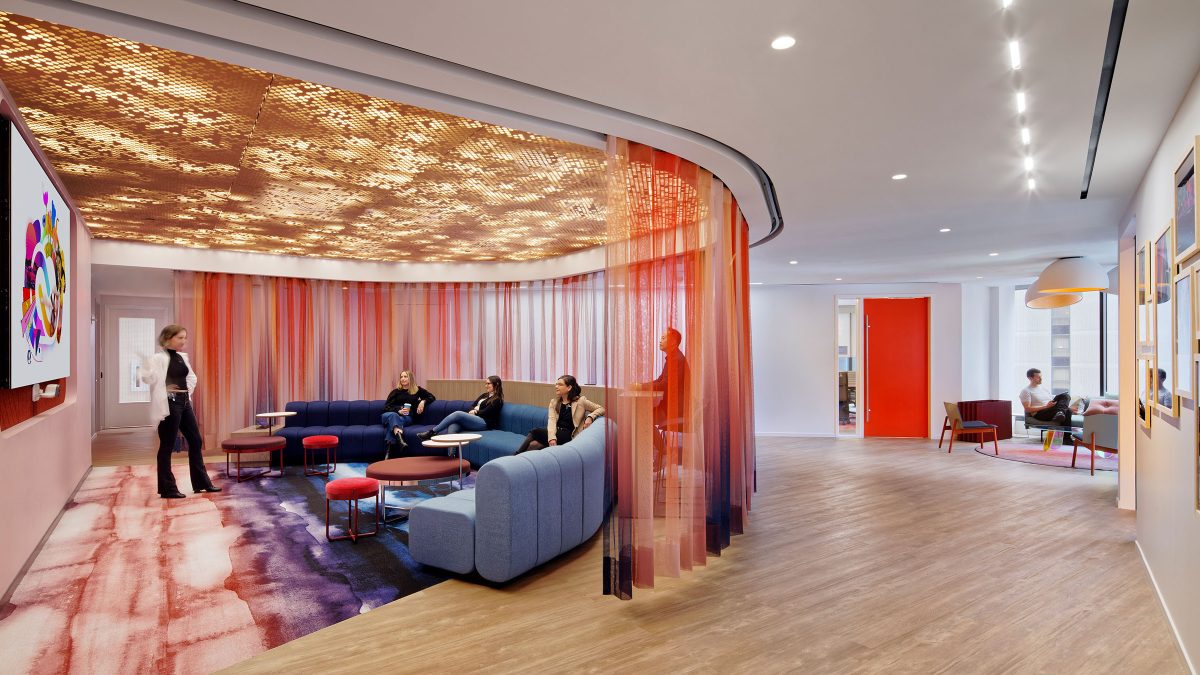
 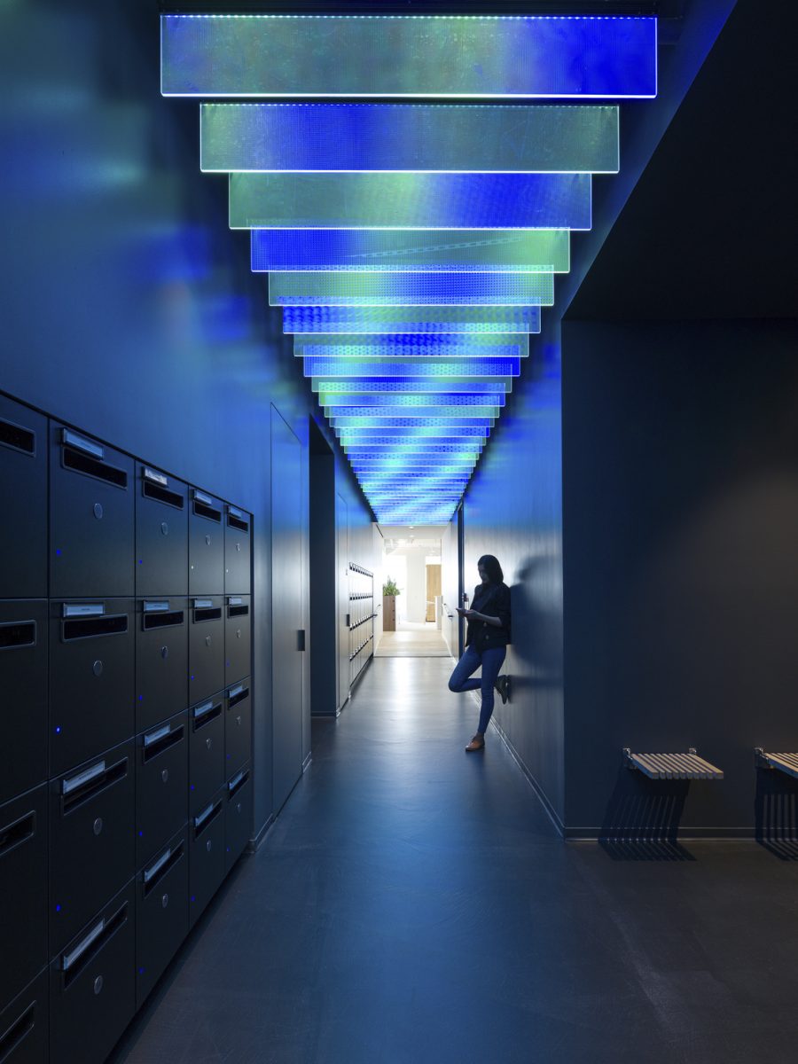 DNB, New York: Inspired by the Northern Lights, colour became an experience by transforming a transitional space into a moment of wonder and brand expression.
 Need help navigating the palette? As a workplace interior designer in Vancouver, we’re here to make the process clear, collaborative and human. Infuse your environment with hues that enhance creativity, elevate mood and boost productivity. Contact us today to discover how our office interior design services can help revitalise your workplace.
Explore how the right colours can elevate productivity, creativity and more, download our guide.
Associate Director - Design & Workplace
Associate Director